We started sharing Visual Studio 2019 Previews with the goal to deliver the best possible experience through a more open dialog.
Over the last few months, we’ve seen lots of thoughtful and passionate discussion throughout the community, on the blog, in Developer Community, and a bunch of social media sites. Through these previews, we were able to share some of the UI changes in this release.
We want to say thank you for sharing this feedback. Everyone working on the team has read through all the comments and we’ve done our best to respond to the different themes discussed in the threads.
Hopefully, by now you’ve had a chance to try the Visual Studio 2019 Preview. If not, we encourage you to try out some of the new experiences. There were a few popular themes in the feedback that we wanted to acknowledge and talk a bit about the changes we’ve already made based on your feedback.
Combining the title and menu bar
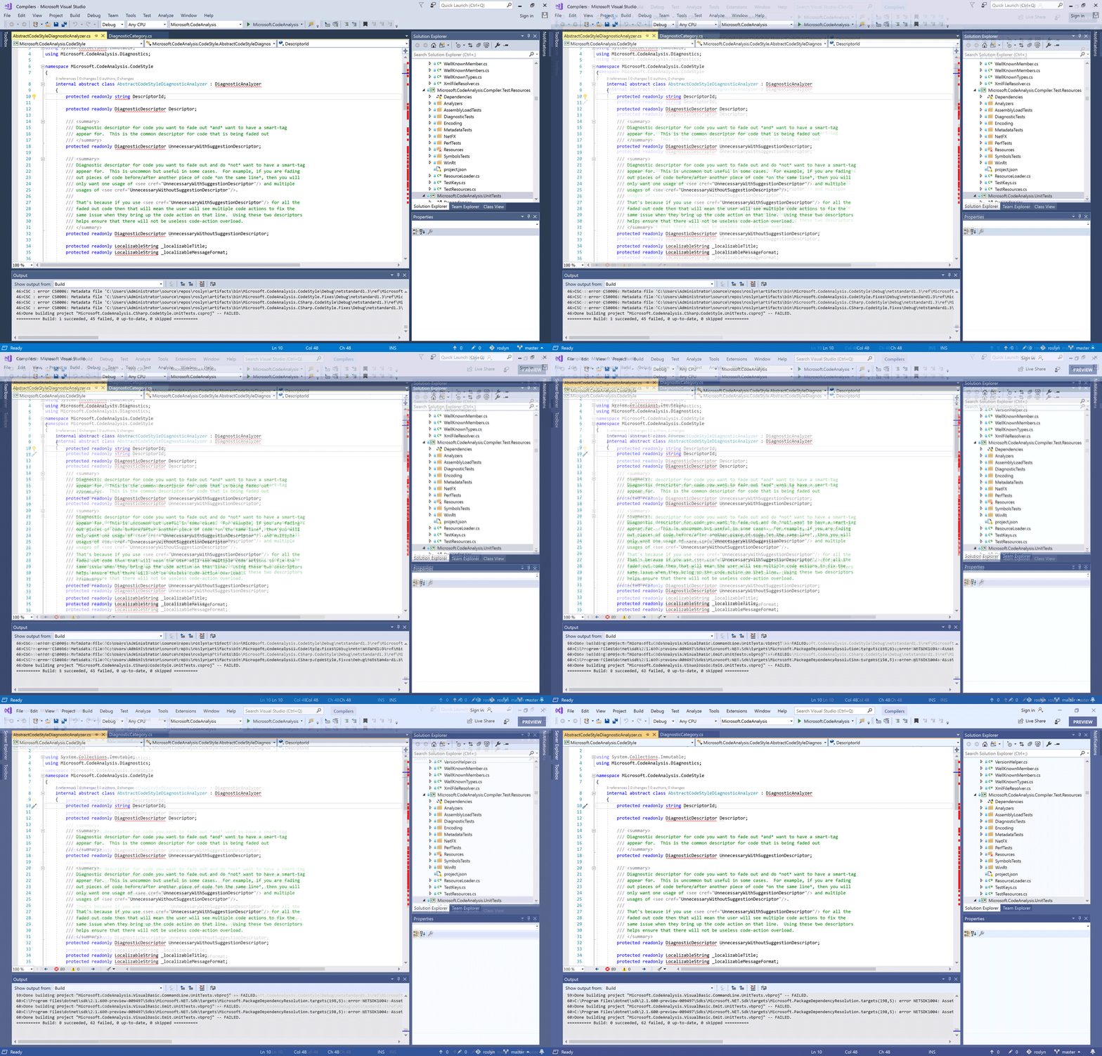
With the combined menu and title bar, we took an opportunity to give back valuable vertical space and update the layout of the upper shell controls. This also makes the new more accurate VS Search more discoverable and accessible. While we strived to do this without impacting your workflow many users highlighted the title bar was home to several information elements including solution name, administrator mode, experimental instance tag, and the preview badge the were important for navigating between multiple instances of Visual Studio running at the same time.
When we first combined the title and menu bar, we were careful not to remove the solution name from the app title that appears when you ALT+TAB or hover over the app icon in the start menu. We found in controlled studies testing these were the most commonly used elements for establishing context across instances of Visual Studio. As we started to test the changes internally though, feedback surfaced that users still found the missing solution name jarring so we started working on some potential solutions.
We heard another piece of feedback from the community that we’d heard in our studies; users often need more context than just the solution name. Having seen this feedback before in some of our studies we experimented in Preview 1 & 2 with a new home for solution name in the status bar next to the existing branch switcher. While this design had the benefit of bringing solution and repo information closer together it wasn’t very discoverable and didn’t work well with cascaded windows. Preview 3 now brings back the solution name into the combined title & menu bar and updates surrounding controls to reserve space for the name.

The title bar included other information in addition to the solution name. We took steps to preserve the other contexts that were previously available in the title bar including Administrator mode, experimental instance, and preview channel by displaying them in a badge under the window state controls. The “Send feedback” and “Live Share” controls are available on the toolbar row while the notification icon has a new home in the bottom right of the shell to better align with common notification patterns.
Blue theme changes
Another goal for Visual Studio 2019 was to make it easy to tell the difference when you have different versions of the IDE open, be that 2012, 2017 or 2019. We refreshed the blue theme, which we’d not touched since 2012, to indicate this step into the future.
What we found through the feedback is that some functional elements from the original Blue theme were lost with the first iteration of the theme update. While most of you generally liked the new theme some customers gave us feedback that it removed some spatial definitions in the UI that helped navigate around the IDE quickly and intuitively. Comments also pointed out that the blue theme updates had gotten too bright adding eye strain over longer periods.

For Preview 3, We’ve heightened overall contrast which in turn helped improve legibility, accessibility, and wayfinding throughout the IDE. We reduced the brightness of the base color and added a set of complementary and analogous accent colors. These changes preserve an at a glance difference between versions while tackling the functional feedback.
New Icons
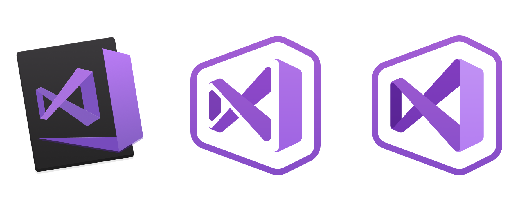
While not the most glamourous part of a new release, the new product icon is an important way to identify our IDE in a busy taskbar, start menu or desktop. It’s also another way that you can tell the difference between versions of our product. In our original post we explained the approach we’ve taken to simplify the icon for Visual Studio as well as create a system for showing the difference between a Preview and full released version.

We’ve now applied this approach to the Visual Studio for Mac icon which is available to download from our website. One of the challenges with the icon for Visual Studio for Mac was how to create an icon that was closely tied to the Visual Studio Family line of products but that stood apart from the Windows version of Visual Studio so as not to confuse you into thinking they’re the same (just on different platforms). We experimented with many ways of showing a differentiation between the two applications but settled on tying them together as a family, with a background shape that echoes the form of the Infinity Loop, and adds a macOS flavor to the icon.
Let’s continue the conversation
We are truly grateful for all the feedback we’ve received so far and hope to use this to continue to improve the experiences we’re delivering throughout the product. As you find bugs or have suggestions the Developer Community site is the place to log these items for the team to review and the benefit of the community. We’re eager to continue the discussion as you continue to use Visual Studio 2019.
The post Reflecting your feedback in Visual Studio 2019 appeared first on The Visual Studio Blog.